Camera angles/movement
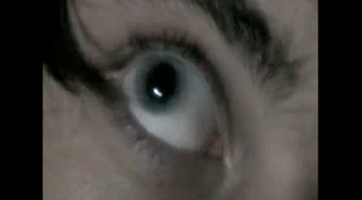
The majority of the camera angles used are close-up or extreme close-up shots, showing intricate detail to the audience and allowing the audience to focus on certain details. This creates a vivid sense of curiosity to the audience as the camera shots only focus on small details, therefore making the audience incapable of seeing the location, main characters etc. Despite the fact that these types of camera shots can be very effective in creating a suspicious outlook to the opening, it does not enable the audience to acknowledge simple details they may wish to know, such as the location/setting, the appearance of the main character. Additionally, there isn't a variety of shot distances, making the opening not as intriguing or entertaining to watch.
 Secondly, there are no variation in camera movements as the camera only freezes on footage, rather than moving around. Instead, the camera fastly jump cuts between the different images, without any transitions. This makes the opening appear to be more 'jumpy' and upbeat, indicating a lack of unease and relaxation, therefore the the fits with the conventions and atmosphere of a thriller.
 Sound
SoundThere is a variety of sound played continuously throughout the opening, the majority of the sound is non-diegetic sound that has been added in afterwards. Likewise to the conventions of a thriller, the music adds an element of mystery and suspense to the opening; this adds a stark atmosphere to the footage being played. The first sound heard in the opening is the sound of a child laughing, the effect of this that it makes the opening appear twisted and unusual. As this sound gently fades the harsh and dramatic sound of a secrurity alarm starts being played. this senses to the audience to feel alarmed and engages them. Throughout the opening there is never a moment of silence, it included sound that will make the audience feel uneasy. Towards the end, there is the noise of a telephone ringing, making the scene feel suspicious and very hidden, revealing to the audience that there is a lot to be explained. In relation to the marking scheme, there is the use of sound with images however, the sound does not appropriately with the themes being represented. This makes the opening appear uncertain and unexplained, therefore giving mysterious approach.
Editing
Throughout the opening, it uses montage editing of a collection of shots to build up the narrative. The montage is very fast-paced, making the the opening feel rushed and 'on-edge'. It inidicates a sense of uncertainity to the audience as it is unclear as to what is happening, this will intrigue them to want to continue watching in order for the images to be explained through the narrative. The fast movement between each image that has been edited that way creates a sense of a tense atmosphere, however there is no development in the montage to hint at the storyline.
Lighting
On different images there is different lighting used, in some parts the lighting is very dull and dim making the frame appear gloomy and low-key. This fits with the themes being introduced in the opening such as death and murder. However, in order to bring attention to some parts and to highlight key features of the opening, harsh and bright lighting is used to give strong emphasis on certain areas, which also creates strong shadows, forming a spooky look. For example, when the arm covered in blood is shown there is a bright light facing the arm, which makes this image appear to be of high importance due to the lighting used. Many of the images are in black and white, which makes the screen appear darker and more dull, and as a result this resembles the mood of the themes well.
Make-up
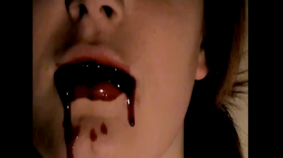
The make-up used in this opening is to enable the audience to understand what is happening in the opening. The main make-up used is fake blood - this creates a realistic feel to the images that relate to the themes being introduced. The make-up contributes to getting the meaning of the image across to the audience. It also makes the frame appear more interesting by bringing the colour red that connotes death, blood and danger.
 Special effects
The main special effect used is an effect available on final cut that allows the screen to move around and 'jumpy'. It makes the images move really fast and appear unstable on the screen, this works well with the themes as the themes making the audience feel uneasy and unsteady, likewise to the movement of the screen.
Credits
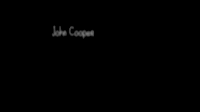
The credits used appear alternately with the footage. The audience sees the footage, then the credits, then back to the footage. There is a black background with a small piece of text in a thin white font that is situated off centre. The text moves around making it go blurry before it focuses. This draws the audience's attention as they are drawn to the text being shown.
 Comparing this thriller opening to the level 4 marking criteria, we have briefly stated the good and bad aspects of this opening:
+
holds steady shots
frames shots appropriately
selects appropriate mise-en-scene
good sound with images
titles used appropriately.
-
no clear introduction to characters (no protaganist/antagonist)
no dialogue
no location introduced
lack of variety of different shots
editing doesn't make meaning apparent
lack of variety of shot transitions
No comments:
Post a Comment