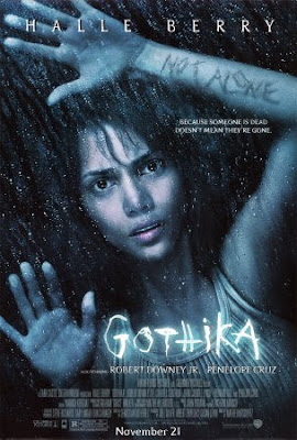
 This poster is for Gothika. Many areas suggest that it's a thriller. The first to stand out is the title, its the brightest part of the poster, the font is scratchy like it was written into a hard surface with a sharp tool, the intense white glow suggests intense heat and pain, like its throbbing. Another piece of text with isn't as easily noticable is the 'not alone' that appears to be scratched onto her arm. It appears to be a drak reddy brown like a scab, it suggests a theme to the film that she feels alone but isn't.
Her facial expressions shows to me, confusion and disbelief. Her eyes suggest confusion and the way her mouths open slightly suggests shes in disbelief or maybe shock. The way her hands are placed suggests shes against a glass window of some kind, maybe searching for help or trapped. how ever the only pressure being applied to the glass is by her finger tips if you were frantic like you would be if trapped or looking for help more of her would be pressed against the glass like her whole left arm or possibly her body to.
The atmosphere created is one of darkness. The background suggests shes without light, hope and security. The rain also suggests she is outside. The costume in this poster is a grubby tank top which again suggests shes been outside and been in contact with the floor, maybe in a struggle.
The lighting is quite lowly lit, her face has more color in than her body which forces the viewer to look at her face. the lighting is effective because it depicts her. Some posters that have a detailed background often lead the viewer to miss the main part of the poster with the most impact. This poster doesn't lead the veiwer a stray with backgrounds. The background blends in with her hair this could suggest somethings closing in or consuming her, maybe a mental fear (psychological thiller) or an attacker is getting closer (crime/action/psychcological thriller)
No comments:
Post a Comment