Monday, 22 March 2010
feedback from s1-20
Friday, 19 March 2010
Monday, 15 March 2010
Screenshots of editing on Final Cut
Aims for editing after feedback
Our aim is to spend the next two lessons before the final deadline recording Lewis's and Bronte's conversation again, edit and add it into our thriller opening and find a font that is suitable to a thriller on www.dafont.com and put it into our opening.
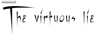
I had a look on www.dafont.com to look at different styles of fonts that would suit the conventions of a thriller. We want to have a font for our title that will suit the style of thriller our opening is.
 We think that this font type is best as the shape fits well to represent that the film is a thriller and the sketchy effect has a conventional effect, so we are going to use this one.


Friday, 12 March 2010
Comments from the Feedback we received
Some critisms that have been made we agree with, for example the fact that the sound quality of the dialogue is quite poor is an aspect of our work that needs improving and as a result, this is our main priority to resolve. One comment from our feedback that we disagreed with was that some people viewed our mise-en-scene in a negative way, by saying that aspects of the narrative were left unexplained. Although that this may have affected the audiences understanding, our group thought that it fitted well with the conventions of a thriller by adding an element of mystery that would intrigue the audience to find our more.
We also recieved mixed views about two aspects of our opening - firstly, people had a variation of views about the rabbit mask at the end, saying that it ruined the ending, whereas others believed it made the opening more thrilling. However, we think that this an one aspect that makes our work look as though it is meant to be an opening rather than an ending. Additionally, people views about our credits differed - some saying it fitted well this our stalker board and others saying it didn't match. We personally thought that our credits was well incorperated and suited the stalker board that we had and thats why we included it.
Also, it would be a good idea to cut the film down a bit as it is 30 seconds longer than it should be and it could result in marks being lost due to not following the rules.
The location was good, as the audience would feel disorientated, adding to the sense of tension. The costumes were good as well, as it fitted in with the thriller criteria.
S1-24 feedback
The narrative made good sense especially with the news board at the beginning linking to the plot of the film, this made the film very easy to understand.
The mise-en scene was appropriate as it was filmed in the dark, also at the beginning the scene with Lewis represented his loneliness which was good.
The constant sound track throughout the film was good and fit the marking criteria well, however the dialog wasn't clear at all and you couldn't understand what he was saying.
s1 19 feedback
The dialogue was difficult to hear as a result of the loud diagetic sound, but this was obviously unavoidable.
s1-20 feedback
However, the mise-en-scene is a bit mysterious, we don't really understand why the woman character was dressed up and then at the end, why the man is stalking her. There is a good use of location, as it shows that the character is waiting for a bus and has nowhere to go. The ending is also good as it leaves it as a cliffhanger and entices you to watch further, however the bit when the man comes back with the mask on kind of ruins the ending.
At the beginning, there is a good use of sound when the camera is slowly moving into the map as it builds up tension and suspense. On the other hand, the speech during the meet is a bit quiet and could be helped by loudening it.
feedback from s1-21
Tuesday, 9 March 2010
Monday, 8 March 2010
Progress Report
Our objectives now are to finalise the editing, this will consist of making few adjustments and changes to the editing and sound track.
To start with, we all listened to the music track together and spoke about the different sounds Lewis has used in the track. We decided that we are on the right track to matching a great piece of music to our film. We have experimented with different tempos in the sound track and found that little changes can make big differences in energy and meaning of the track e.g. a slower tempo in the introduction of the track, which establishes the kidnapper played by Lewis. We found in this part of the film the slower tempo gave a really good atmosphere to the film.
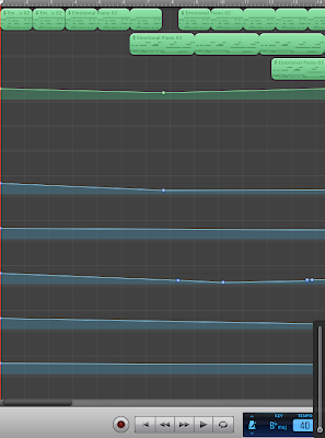
We have found that delegating tasks throughout our group have really improved our works' standard and how quickly we do our work. We are aiming to complete our editing work by merging the sound track and film by tomorrow's lesson, so we are ready to show our rough cut on Friday and from there be able to make any changes ready for our final deadline.
Friday, 5 March 2010
More editing progress
In addition, Jess found some effects that changed the appearance of the footage, such as an effect called Light rays which we added when you begin to see Lewis walking down the street, we thought this added a fascinating feature to our footage that showed the scene change from the first half to the scene on the street. We also added an effect called Bloom which made the light that appears on in our footage, such as: Street lights, shop windows etc more vibrant and stand out more. A transition that we added several times was called cross dissolve which was a simple fade to make our work flow gently and gradually, rather than it be sudden and not work well with the footage. Overall, today's lesson we got quite a lot done and had a productive lesson.
Stalker Music
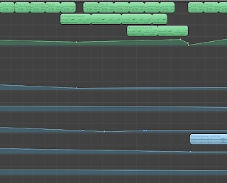
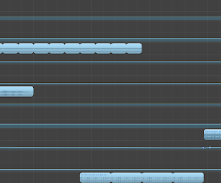
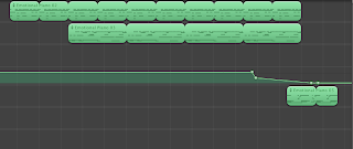
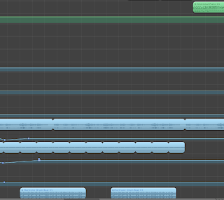 Our inspiration for the opening of our soundtrack is from the music that is played at the start of The American movie 'American Psycho', as you can hear at the start of our soundtrack it is very calm and peaceful with a delicate and simple piano piece, merged with the sound effects of a storm to add to the atmosphere of the scene and to show it is raining outside of the room. After about 15-20 seconds the melody changes with the introduction of some more intricate piano pieces which merged with the first piece creates a simple yet effective melodic harmony. I also added in a contemplative synth sound to merge with the piano pieces to add an Eire atmosphere to the music to show that something isn't right and to give the viewer a sense that something is maybe going to happen. Throughout the composition i have left the piano in as it always gives a feeling of calm whereas later in the composition iv added an electric guitar riff in their to make the sound and feeling of the scenes quite static and uncertain and then halfway through the compostion I've added a more bassey sound into the composition still keeping with the piano but the electronic bass makes the tempo fast and makes the sound seem alot harder and more tense to emphasise to the viewer that the scene is becoming tenser. The mix of the calm piano and the tense guitar sound and the bass mixes well giving the viewer many different feelings about the scene as they all send different types of sounds to the viewer confusing them but at the same time keeping them in a state of calm.
Thursday, 4 March 2010
Technical equipment we used making our Thriller opening sequence
 The next is the tripod used to balance the camera on. This eliminates shaking or a hand held effect when filming. Unfortunatley ours was a bit stiff and jerked when we tryed to pan a shoot of lewis walking back towards bronte at the bus stop.
 After we had our footage we captured it on Final Cut Express, which is the below logo on an Apple Mac. In final cut we edited our footage roughly into the right order with the decent takes. In final cut we managed to speed up, slow down, change sound levels to quieten traffic, add effects and transtions and make our sequence what it is. Eventually we may also use Final Cut Express to annimate our ident.
Whilst the editing was taking place, Lewis used Garageband to create a soundtrack to fit out film sequence. This program enabled us to even record our own sounds, even though we chose not to do this its still a feature included. There is even a feature were you can plug in your own keyboard and record your own melodys. On Garageband Lewis changed tempos and keys.
 Photoshop was used to make our ident. The layers will be animated through to create a moving ident. Starting off with one picture we edited it through to end with our 'Pulse Productions' in the 'Pulse' font from http://www.dafont.com/
Tuesday, 2 March 2010
Analysis of a thriller poster
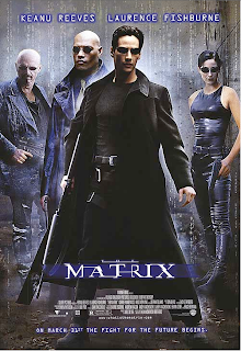 This is a poster advertising 'The Matrix' movie (1999).
 Evaluation Questions
1. In what ways does your media product use, develop or challenge forms and conventions of real media products?
2. How does your media product represent particular social groups?
3. What kind of media institution might distribute your media product and why?
4. Who would be the audience for your media product?
5. How did you attract/address your audience?
6. What have you learnt about technologies from the process of constructing the product?
7. Looking back to your preliminary task, what do you feel that you have learnt in the progression from it to the full product?
Monday, 1 March 2010
Evaluation Questions
In our opening what conventions have we included that makes it similar/different to existing, professional films. Talk about: music, character conventions, camera work, editing mise-en-scene etc.
2. How does your media product represent particular social groups?
Talk about an existing movie character that is similar to your main character(s) and explain their character role, personality and appearance and how is it similar to yours?
3. What kind of media institution might distribute your media product and why?
Explain would type of institution would best suit your film, e.g. cinema, TV, internet
4. Who would be the audience for your media product?
Explain the type of people who are most likely to want to see your film. Explain the age range, gender, what other movies they would like to watch, classification, their interests
5. How did you attract/address your audience?
What aspects of our opening have you added to ensure that the audience want to watch the opening and continue to be engage throughout the opening?
6. What have you learnt about technologies from the process of constructing the product?
Explain the types of programmes you have used, e.g. Final Cut, Garageband and what have you learnt about these programmes. Also, state what problems you had, how you solved them and how to improve
7. Looking back to your preliminary task, what do you feel that you have learnt in the progression from it to the full product?
Explain how your knowledge has developed and say what you have learnt from the progession from the Pre lim task to the final task.
Progress of editing
Once Bronte and Jess had initially put our footage in the right order and made the narrative clearer, we then focused on the more creative aspects of our work. So far Jess and Bronte have been on Final Cut looking at the types of things we could use and have been experimenting to see what works most effectively to suit the conventions of a thriller. At the very beginning of our footage, we added slow motion to make it slow and more gradual. We have added some transitions to our work to make the movement from one clip to the next flow more casually and less sudden, unless we wanted it to for effect - we added a transition that made the footage more 'jumpy' and sudden to our credits. Luckily, Jess managed to find a feature on Final Cut which allowed us to quieten the sound of the traffic in our footage, which meant that the sound wasn't as loud and made our sound quality better.
Analysis of 'Blog of the Week'
Target Audience

Sunday, 28 February 2010
Thriller poster analysis
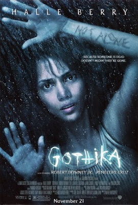 This poster is for Gothika. Many areas suggest that it's a thriller. The first to stand out is the title, its the brightest part of the poster, the font is scratchy like it was written into a hard surface with a sharp tool, the intense white glow suggests intense heat and pain, like its throbbing. Another piece of text with isn't as easily noticable is the 'not alone' that appears to be scratched onto her arm. It appears to be a drak reddy brown like a scab, it suggests a theme to the film that she feels alone but isn't.
Her facial expressions shows to me, confusion and disbelief. Her eyes suggest confusion and the way her mouths open slightly suggests shes in disbelief or maybe shock. The way her hands are placed suggests shes against a glass window of some kind, maybe searching for help or trapped. how ever the only pressure being applied to the glass is by her finger tips if you were frantic like you would be if trapped or looking for help more of her would be pressed against the glass like her whole left arm or possibly her body to.
The atmosphere created is one of darkness. The background suggests shes without light, hope and security. The rain also suggests she is outside. The costume in this poster is a grubby tank top which again suggests shes been outside and been in contact with the floor, maybe in a struggle.
The lighting is quite lowly lit, her face has more color in than her body which forces the viewer to look at her face. the lighting is effective because it depicts her. Some posters that have a detailed background often lead the viewer to miss the main part of the poster with the most impact. This poster doesn't lead the veiwer a stray with backgrounds. The background blends in with her hair this could suggest somethings closing in or consuming her, maybe a mental fear (psychological thiller) or an attacker is getting closer (crime/action/psychcological thriller)
Friday, 26 February 2010
Analysis of thriller trailer - The Dark Knight
How does the music work along side the editing to create tension and build suspense?/How does the music indicate to us that the genre of the film is a thriller?
The music plays a crucial role in the trailer of 'The Dark Knight' as it essentially works along side the editing of the footage to build tension and continously engage the audience throughout the trailer. The first sound to be heard is non-diegetic sound of a fairly low-beat, dominant and fierce soundtrack that creates the atmosphere and sets the scene of the trailer. Throughout this part there is a sound similar to a heartbeat that can ben heard, which keeps the opening to the trailer fairly grounded and still. After around 5 seconds the main characters voice appears in a very creepy/evil approach, at this point the non-diegetic sound quietens to indicate the significance of the voice of the Joker. The sound alternates between the soundtrack and the voice of the Joker, the non-diegetic sound is low-beat and slow-paced to compliment the the voice of the Joker which is also slow and deep. This makes the trailer appear quite dominant and fierce, therefore indicating the type of movie it is. This continues until the audience hears an evil laugh - after this the trailer intensifies and and pace begins to speed up which ensures that the audience stays engage.
The audience can also every now and again hear diegetic sounds such as guns, the fast movement of cars and fire explosions. These sounds are highly exaggerated to suit the type of movie it is and to add dramatic effect and increase the intensity of the trailer. This helps the audience identify what may be included in the narrative and the types of settings, location the film is located. As the trailer persists, the footage jumpcuts very often and as it continues the jump cut becomes almost instant to give the audience hints to the footage, as this happens the the music connects to this by intensifying and becoming faster, this reveals the approaches in the movie by indicating what is going to be included, without fully giving everything away. All of a sudden, the audience sees a lorry crash, in which all other sounds have been muted and then everything pauses and to allow the dialogue to return, this gives the impression of a sense of uncertainity. At the very end, the Title appears in which the music enriches the importance of this part by the sound being loud, dominant for the audience to focus on the screen.
Analysis of thriller poster - American Psycho
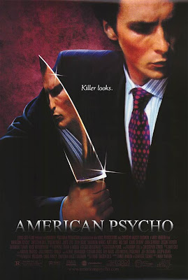 This is the official poster for 'American Psycho', a thriller made in 2000. The use of mise-en-scene in this poster tells the viewer a lot about the movie. Firstly, the use of props such as the knife which is very central in the poster reveals its significance. Including a weapon instantly indicates to the viewer the types of themes that are going to be included in the opening, therefore making it obvious as to the what genre the movie is. The use of a knife has an ambiguous interpretation as it could be viewed as a weapon, however the positioning of the weapon on the page in which it reflects the face of the character makes the viewer interpret it as a mirror suggesting the notion of vanity and pride. Considering that the tag-line for the movie is 'Killer Looks' and 'Evil never looked so damn good' it excites the curiosity of the viewer as they are uncertain of the role of the character as there is a twist in the poster.
The costume in the poster plays a significant role of identifying the type of character he is. It gives a vivid sense of professionalism and smartness, suggesting that the character is a career-focused, respected and business-like individual. The man character is played by Christian Bale, a well-known actor in the film industry. Using a world-wide famous actor encourages people to watch the movie, and as the main character is viewed as attractive it encourages females to watch the movie, which widens the target audience of the movie. The notion of glamour is evidently indicated through the use of the sparkles surrounding the knife. This ensures that the viewers focus their attention on the knife, which gives the impression that the knife is of a high importance, emphasising the glamourised approach to the prop.
The use of colour on the poster closely follows the conventions of a thriller by using dark colours, such as black, grey and red. This helps reveal to the audience that the movie is a thriller as the colour suggests the type of narrative likely to be included. The repeated use of red in the background and on his tie symbolises the the idea of death, danger, blood etc. which hints the narrative in the movie. The strong non-diegetic lighting also creates an atmospheric surrounding by showing light areas on key features of the poster such as the knife and there is light on the side of the character's face, whereas the other side is dark, suggesting a mysterious, suspicious character.
Lastly, the font of the title and the tag-line matches and accentuates the themes portrayed in the poster. The tag-line has used simplistic, italic writing making it appear fancy and glamorous. The colour makes it stand our against the black background, which makes the more eye-catching for the viewer.
Evaluation of filming 2
The main problem that we had was that for our tracking shot we needed a dolly in order keep the camera very steady, however, the media department said they didn't know where one was so as an alternative we had to use a chair with wheels on and then placed the tripod onto the chair. We slowly and steadily moved the chair whilst holding onto the camera, however the first tim we done it the camera slowly tilted to one side which meant we didn't get a steady shot.
We felt quite organised as Jess remembered to bring in the 'Stalker board' that she had made and Bronte remembered the storyboard to follow. Lewis was suppose to bring in his suit, however he forgot to but somehow remembered his blazer...
Bronte emailed our teacher, Holly during the halfterm to ask to use the camera during our lesson, therefore Jess and I were organised for this part of the filming, to ensure that the filming went as effeciently as possible. Although we had planned everything well and we felt we were organised by having our ideas ready and bringing in the props some problems still occurred - as Tom was unaware of the ideas for this part, it was Bronte's role as director to direct and explain to the Tom what was happening as he filmed parts of it, however depsite our thorough planning and Bronte's control of the group, Tom had a mind of his own and decided to do his own thing which prolonged the filming process. As a result the filming took just under an hour and a half, which is one lesson worth.
Monday, 22 February 2010
Analysis of feedback
Most of the feedback can now be used very constructively, as our problems and areas which we can improve on have been identified. we will review our work together and will then try to improve on areas where we can as our feedback was majorly positive feedback, so we do not have as much work to do as other groups in the class who have done a shorter, and less detailed post.
feedback from S1-23
feedback on final ideas
feedback from S1 20
They seem to have understood the importance of conventions well and used them correctly to fit the theme.
Feedback from 21
The ten second breakdown is explained well and gives you a visual idea of their opening sequence. It shows a creepy, almost scary impact to the audience. The conventions such as variation in shots is good well explored. However filming outside may not go according to plan, so they need to make sure they begin filming earlier in order to capture all their footage encase the weather is bad. Having a larger group you need to make sure you are all on the same level and know what is going on, so making sure to remember the props and costumes for each other is essential to film. Over all 22's thriller film is well organised. The music definatly relates to the theme well.
:)
Sunday, 21 February 2010
Ideas and planning for Filming 2
Our thriller will begin with a long shot/establishing shot of an isolated room that appears empty and will give the impression that it is unused. The camera will very steadily and slowly to zoom into the room in order to reveal more to the audience. Around the corner of the room there will be bare wall that has our 'Stalker board' displayed on it. Lewis will be standing beside the wall looking at the photos, he will be dressed in his suit to ensure that there is continuity onto the next scene. As a glimpse of Lewis's character appears on screen and before the audience can fully identify what is on the wall, the camera will do a sudden jump cut to another viewpoint of the wall to fully reveal the images etc. that is on the wall and then will slowly zoom in likewise to before. This will immediately allow the audience to identify with the themes and narrative involved in our thriller.
There will be non-diegetic sound played throughout this part that will start as soon as the fooage appears on screen. The music we aim to be instrumental that is fairly quiet and becomes gradually louder to build suspense. There will be a sudden jump cut to a medium shot of the photos on the Stalker board. We will make the camera vary its shot distances to show both close-up and far away shots of images on the stalker board. At this point, the tension will become more intense and the pace of the camera movement will speed up to give a sense of uncertainity. As the camera then slows down it will then focus entirely on one photo - the camera will then return to the steady movement as it was at the beginning and zoom into this photo until it is a close-up of the image. As the camera is zooming in Lewis's hand will appear on the screen and he will aggressively pull the image away from the wall to emphasise to the audience that the person in the photo is significant in the narrative. A close-up of Lewis's wallet will appear on screen and he will fastly and nervously put the photo into the wallet.
How is this part of our opening conventional to a thriller?
Mise-en-scene
The mise-en-scene will appear dark and the colours apparent will be fairly neutral, except for the red pen markings on the photos that will be red, symbolising danger, death, blood etc.
Sound
The main purpose of the sound is to appear eerie, creepy that will add suspense and build tension in the opening which follows the conventions of a thriller
Location
To follow the conventions of a thriller the location is deserted, quiet and empty which emphasises the creepy approach
Characters
In this part of the opening, only on of the main characters is shown - he appears isolated, mysterious and dark which makes audience unable to relate to him.
Props
The props used are to gives hints to the themes that occur in our thriller, therefore making it relate to thriller conventions
Camera shots/movement
There is a lot of variation in the camera shots/movement and in particular close-ups mean that the audience are unable to see elsewhere in the frame as they focus on one area, which adds mystery and a sense of the unknown
Props that will be needed for this part:
- Pins to hold images together
- Stalker board - photos, map, drawn images, newspaper article titles
- suit
- wallet
- paint
- string
Tuesday, 16 February 2010
Thriller title ideas
This is a list of the characteristics of a stalker:
- compulsive
- manipulative
- dark
- obsessive
- strives for control over others
- is unable to take "no" for an answer
- isolated
- views self as a victim
- unable to cope with the rejection
- jealous
- does not take responsibility of own feelings or actions
- mysterious
- deceptive
- sense of entitlement
- obsessive
Certificate for our thriller
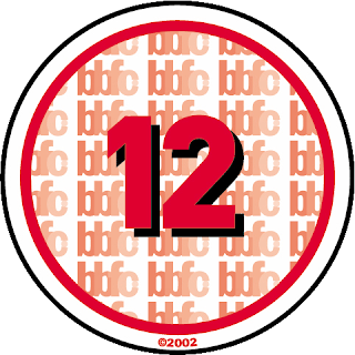
 Our thriller would be best suited to be a 15 for several reasons. The themes included in our thriller would be accepted to be a 15 as although the themes are mature, the portrayal is suitable for the age group as it isn't explicit or very frequent. The use of horror is very moderately psychological and the sequences are not disturbing or frequent, therefore making it suitable for a 15 rating. Any form of dangerous behaviour is not included in our thriller and use of strong language is not used at all in the opening.
BBFC certificate criteria
 Discrimination
Discriminatory language or behaviour must not be used explicitly and aggressive discriminatory language or behaviour is unlikely to be accepted
Drugs
Misuse of drugs must be infrequent and must not be encouraged or glamorised.
Horror
Moderate physical and psychological threat are allowed, as long as disturbing sequences are not
frequent.
Imitable behaviour
Dangerous behaviour (for example, hanging, suicide and self-harming) should not be included explicitly which could be copied, appear pain free or harm free.
Language
Moderate language is acceptable. The use of strong language must be infrequent.
Nudity
Nudity is allowed, but in a sexual context must be brief.
Sex
Sexual activity may be briefly and discreetly portrayed. Sex references should not be beyond what is appropriate for young teenagers. Crude references are unlikely to be acceptable.
Theme
Mature themes are acceptable, but their portrayal must be suitable for young teenagers.
Violence
Moderate violence is allowed but should not be in detail. There should be no emphasis on injuries or blood, however occasional gory moments may be permitted if justified by the context.

Discrimination
The film as a whole must not encourage of endorse discriminatory language or behaviour.
Drugs
Drug taking may be visible but the film as a whole must not promote or encourage drug misuse. The misuse of easily accessible and highly dangerous substances (for example,
aerosols or solvents) is unlikely to be acceptable.
Horror
Strong threat are permitted unless sadistic or sexualised.
Imitable behaviour
Dangerous behaviour (for example, hanging, suicide and self-harming) should be detailed if it could be copied. Easily accessible weapons should not be glamorised.
Language
There may be frequent use of strong language. The strongest terms may be
acceptable if justified by the context. Aggressive or repeated use of the strongest language is unlikely to be acceptable.
Nudity
Nudity may be allowed in a sexual context but without strong detail.
Sex
Sexual activity may be portrayed without strong detail. There may be strong verbal references to sexual behaviour, but the strongest references are unlikely to be acceptable unless justified by context.
Theme
No theme is prohibited, provided the treatment is appropriate for 15 year olds.
Violence
Violence may be strong but should not focus on the pain or injury. The strongest gory images are unlikely to be acceptable. There may be detailed verbal references to sexual violence
but portrayal of sexual violence must be discreet.
Tips for filming
2) Plan thoroughly beforehand
If you have planned what needs to be achieved and how you are going to achieve it well in advance this will mean you will minimise the issues that may occur when you come to film. This will also reduce the amount of time spent rehearsing/practising what you need to do on the day to make the filming process more straightforward and efficient. This means that the you can focus on the practical elements of your work, in order to make the outcome have a higher impact.
3) Film everything for longer than expected
By doing this is it means that when you come to edit you cut and edit the parts that aren't imporant in order to use the parts that are most important to be in your footage. If you film to little, you will have to make do with what you have, however if you film for longer than you need you can work out and decide which part you want to use and how long you want that part to be played. If you film for longer it means that the camera person can figure out the best camera shot/movement is best.
4) Always use a tripod unless it's for effect
this will increase the likelihood of creating a steady shot. If the camera is constantly moving and shaking it means that the audience are likely to be distracted by the unsteadiness of the camera. This means that they won't concentrate on the presentation.
5) Film close to the object
If you are trying to create a close-up of an object, instead of zooming into the object it is better to physically move closer to the object. This will allow the object to be clearer and the sound quality will be better, which means the whole screen will look better visually and aurally.
Call sheet for filming
We are going to film on Monday the 8th February at 4:00pm when college ends. The plan is for Lewis, Bronte and Jess to meet outside our media classroom and go to the media office together to pick up the camera and tripod. As Jess is going to Poland the next day and Bronte isn't in college until 10:45, Lewis will take the camera equipment home and return it to the media department before 9:00am on Tuesday.
Location
We have chosen to film on Cherry Hinton road which is near the Cambridge leisure centre. We decided to film here because of the accessibilty to get to this location. The appearance of this location is ideal as it is near recreational shops that make the location appear casual and similar to everyday life. The bus stop is very similar to the bus stop we had in mind and we will be able to have sufficient space to film what we need. Additionally, this location is easily accessible as there are many buses running through this area, therefore we can get the bus from college to the cambridge leisure centre (outside Hills Road) and then walk down to the bus stop. We are planning to get the citi 7 bus. As this location is in a public area, there are more health and safety considerations we need to take into account. The main issue is that we need to be considerate of are the vehicles and pedestrians that will be passing by.
Lighting
We will be filming at around 4:30pm, therefore we want to film as it starts to get dark in order create an atmosphere through the lighting. However, we don't want it to get too dark, so that the screen quality is affected.
Actors
The people who are acting are:
Lewis as the stalker, who is the main character
Bronte as the teenage victim, who is the second main character
Jess as the extra person at the bus stop to make the location seem more natural.
Lewis and Bronte are the characters who will be having a conversation, we will be taking the script that Jess and Lewis wrote with us so that the characters know what to say.
Film Crew
Everyone in our group will be taking it in turns to film different parts of our thriller, although Jess is the main camera person who will be filming the most, as she is acting the least.
Props
We will need several props to take with us on the day and Lewis, Jess and Bronte will be in control of taking different props. Bronte will be bringing the shot lists and storyboard sheets, rabbit mask, cat ears, eyeliner for cat make-up, black clothes and photos for 'stalker board'. Lewis will be bringing in his suit and Jess will be bringing in her wonder woman outfit.
Back-up plan
As we are filming outside we will need to consider the weather, if the weather was to be bad on the day, we will postpone the filming until another day, as we have no other choice but to film outside because the location is an important aspect of the filming.
In this part of the filming we will be filming the last 3/4 of our thriller, we will be closely following the storyboard we made in order to get the certain camera shots/movements we want. There aren't any particular sounds we need to capture during the filming, as this will be added in when we edit.
Monday, 15 February 2010
Our stalker board
 This is our initial map on a piece of A1 board. It features Cambridge and the surrounding areas, the area where our thriller opening is set.
Here i have started to add pictures and string going from the headlines and photos to locations. On this picture the string appears to be the same color as some of the roads but in real life they do stand out.
In the right corner is where Bronte's character comes in. Using a ringed papparazzi style photo along with a sketch of the rabbit mask should indicate to the audience shes next. The rabbit mask sketch should indicate a masked man? or like other photos where I've included sketches it might indicate whats going to happen to her. This corner will have no newspaper clippings near, nothings happened to her yet so she wont have had any stories published about her at this time.
This photo also shows 3 colored photos in a pile, which will be 4. They are for our opening credits. They were printed in color to make them stand out from the images connected to the stalker and his doings. These photos will have our roles underneath so our credits can link to the stalker board and the audience will know everyones part.
Close up photos of our color photos and roles.

These are unfinished i need to add 'Editor' trim off all the white paper and stick them on the stalker board. Hopefully they have a nice 'stalker board' feel to them. Each letter is an individual cut out from the Sunday Times newspaper which took a long time but all worth it.

This is our final stalker board. The only thing missing is our color role photos, but I thought the rest of the group would appreciate putting theirs where they wanted.
I feel there needs to be more newspaper clippings but looking at it I think its only the right hand side thats lacking but that would counter act the string, I didn't want it to look to busy.
I think more chunkier headlines wouldve been good but there are slim pickings. Lots of these sorts of stories are from Iraq, China, Turkey and Russia so the stories are in tiny sections all on half of a page, so the headlines are small. The foreign sotries were used the middle on the right hand side and the bottom. These two and one more, the one in the top middle are true stories. The one top, middle was a print out but I felt the paper stood out so I chose not to carry on with this method of story finding, even though searching through 40+ newspapers is time consuming. The story is about a women dieing on station train tracks, I linked this with string to Cambridge station.
I doubt is going to work on a classroom wall but i have faith in my groups choice to do so.
Wednesday, 10 February 2010
The roles of each group member
Producer: Bronte, Jess
Camera: Jess, Lewis, Bronte, Tom
story written by: Jess and Lewis
Editor: Jess, Bronte, Tom, Lewis
Director:
Someone who controls, manages and supervises and instructs the actors and filming crew.
Camera:
The individual or group of people who operate the camera.
Producer:
The person who organises the production of the film including the goods/services (props)
Story writer:
The person who originates or gives existence to anything
Editor:
The person who edits the material/footage
Tuesday, 9 February 2010
1st day of filming - evaluation
However, some aspects we were unable to control - as it was snowing continously throughout the day there was a chance that we were going to be unable to film and that would have ment that we would have had to postpone it to another day. This would have had to be after halfterm as Jess went to Poland on a school trip the next day and was not returning until Friday. Despite this we filmed from between around 4:30 pm and 5:45pm. The area in which we had chosen to film in was a busier road than we anticpated and as a result we experienced many vehicles going past and during the busier times, we had to stop filming for a while before continuing to film again as we tried to reduce problems with the sound quality.
The plan is to film the 1/4 we have left to do after halfterm when the 'Stalker board' has been made. As this part is being filmed inside we expect that less problems are likely to occur and we have an efficient time to plan the filming process for this part.
Monday, 8 February 2010
Possible Locations- Planning for filming
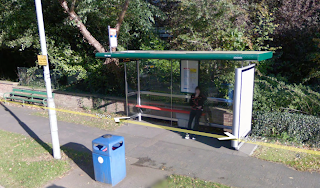 Location 1:
This is one of our possible locations, located down Trumpington Road, it is pretty deserted most of the time, but the only downfall of this is that it may be fairly busy on the roads which will disrupt our sound quality.
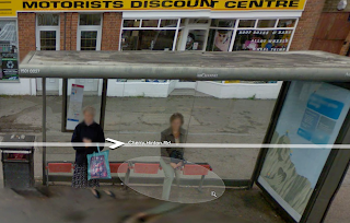 Location 2:
This is another possible location for our thriller film it isn't as deserted as the other as there is shops behind it and other recreational shops e.g Chinese restaurants, the shops are not very inconspicuous with bright yellow signs and displays. This possible location is on Cherry Hinton Road.
Location 3:
Addenbrookes hospital bus stops (back roads)
- these are very quiet and rarely used - our film would be more likely to have a better quality with less disruption from traffic etc, however, occasional traffic could be used as ambient sound to add atmosphere. So there are benefits to traffic and other noises as well.
We had to seriously consider what would be our best filming location, we had to think about the noise of traffic and other people which could effect the quality of our film if it was considerably bad, this lead to a lot of planning and research on where we could film.
Saturday, 6 February 2010
Prop - Rabbit mask
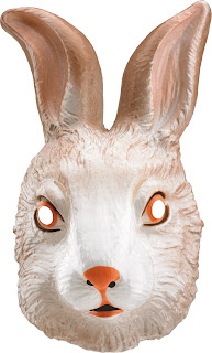 Having been influenced by the rabbit in 'Donnie Darko' this mask is a photo of the mask we are going to use in our own thriller. The aim of the mask was to be a freaky looking rabbit that appears really creepy, rather than a cute, happy rabbit mask in order to fit with the conventions of a thriller. Having the rabbit mask in our opening has allowed us to create a dramatic ending to the opening that adds an ironic twist to the narrative, with the intention of wanting to engage the audience into continue watching.
The film 'Donnie Darko' is about a teenage boy, Donnie, who lives in Middlesex and is viewed to be abnormal. He sees a therapist regularly as his parents believe that he is going insane. This is because Donnie Darko has an 'imaginary' friend called Frank, who is the rabbit. The main purpose of the rabbit is to provide and assist the narrative of the movie, likewise to ours.
The image below is an image of the rabbit, Frank from Donnie Darko:
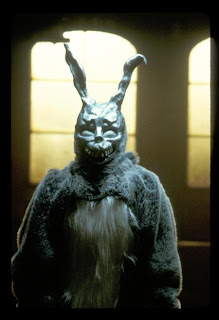 Before Jess managed to get a rabbit mask, I made this rabbit mask as preparation for our filming as this was one of our crucial props. My aim when making it was to create a rabbit that looks freaky and suspicious that is to act as a disguise. However, because Jess was able to get mask we didn't use this in the end. I think that the mask we did use was more professional and made our mise-en-scene more advanced.

Friday, 5 February 2010
Detailed shot list for our Thriller opening

 These two photos are our shot list demonstrating the camera angles, actions, location and props involved in each shot/section out of 21. This shot list is to assist the our explanation from our storyboard that included writing and illustration of our thriller opening. This shot list has given our group more guidance and assistance for when we come to filming, that will hopefully be of good help in order to make the filming process more straightforward, having planned this part more thoroughly.
Detailed timeline of finalised idea
At the beginning, we will show our ident but as we haven't finished animating it, we will see how time goes towards the end of our project before to see whether we have time to make our ident.
0-10 seconds
Our thriller will begin with tracking shot, where the camera is very slowly moving into a room and it will curve around the room to reveal the photos on the wall and a glimpse of Lewis standing there looking at the photos. Lewis will be wearing a suit to emphasis his business-like and ambitious character. The props included in this part will be the photos and images displayed on the wall.
11-20 seconds
After 10 seconds the part from above will continue as the camera will be moving slowly to enhance the mysterious approach in order to fit with the conventions of a thriller. The camera will then jump cut to another part of the room, this will be a long shot in which the photos will be shown from another angle. The music played at this point will be really slow and have a low-beat that will suit the movement of the camera, this will build the tension and add suspense to the atmosphere we would like to portray.
21-30 seconds
A medium shot of the camera skimming over the images so that the audience have a closer view of the photos in order to introduce the themes in the thriller. On the left side of the screen the audience will be able to see the side of Lewis's face - this will add a mysterious approach as the audience will have been introduced to the main character but not fully. The music here will be fairly quiet and relate to the fast-paced movement of the camera.
31-40 seconds
As the camera movement slows down it will focus onto one photo (a photo of Bronte) the camera will zoom in to signify her importance in the narrative. The music played at this point will change from the existing music to highlight the importance of this part. As this is happening Lewis hand will appear as he aggressively rips the photo off the wall.
41-50 seconds
Another close-up will appear of Lewis hesitantly and slowly putting the photo into his wallet. The music will become louder and the pace will become faster to create an atmosphere to relate to the themes. The location will still be in the same room as the beginning but as it is a close-up the surrounding won't be important. There will be a sudden jump cut to Bronte sitting at a bus stop, therefore the audience can see the relation between the photos and the the next part of the footage. Bronte will be dressed as though she is going to a Halloween party. There is a change in location at this point from the room to a bus stop - this will be a long shot in order for the audience to establish the location and to see the next main character Bronte. In order to make the scene look more realistic and authentic Jess will also be standing at the bus stop dressed in an outfit for Halloween. The atmosphere here is fairly ordinary.
51-60 seconds (1 minute)
There will be an over the shoulder shot from Lewis's point of view of him removing the photo of Bronte from his wallet, while in the background the audience will be able to see Bronte waiting at the bus stop. This will emphasises the mysterious and suspicious approach.
61-70 seconds
The camera then returns to a long shot of Lewis walking casually along the the street, we will have exaggerated footstep to make him appear powerful. He will be dressed in a suit to give the impression that he is on his way home from work. The suit gives a sense that he is a well-presented and well-respected business man. At this point we will use match on action in order for the audience to see more than one angle of the main character. The music at this point will add dramatic effect so that Lewis's importance in the narrative and to make this part of the opening significant.
71-80 seconds
This continues during this section and the audience will then see Bronte again waiting at the bus stop. A long shot will then show Lewis walking past Bronte to emphasise the suspicious approach in the opening that will follow the conventions of a thriller. Lewis makes eye-contact at Bronte and then walk past to add a dramatic effect.
81-90 seconds
The audience then see Lewis turn back round and start walking back to where Bronte is, there is a pan shot of Lewis walking closer to Bronte, this is where the dialogue is going to begin. As the conversation between Lewis and Bronte starts, we will use shot reverse shot to display both of the character talking. Lewis's personality will appear to be confident yet dark and mysterious. Whereas Bronte's reaction will appear weary and uncertain.
91-100 seconds
The conversation continues, as there is a shot reverse shot there will be a low angle shot facing Lewis to highlight his dominance and authority. In contrast, there will be a high angle shot of Bronte to display her weakness. Towards the end of the conversation Lewis begins to become impatient and walks away. As Lewis walks away and he appears off screen, a pan shot from Bronte's perspective to see an empty bus stop.
101-110 seconds
She begins to look away still waiting for the bus stop. Here the music becomes more intense to signify to the audience that something is going to happen, however Bronte will appear oblivious to the situation. Lewis will then reappear in a mask even though Bronte is unaware of Lewis's actions.
111-120 seconds (2 minutes)
As Bronte is sitting there the camera zooms into a close-up in order to make the audience unable to see what is happening elsewhere, in order to enhance the suspicious approach. As Lewis sits beside Bronte the camera zooms out. He speaks to Bronte and Bronte turns her head in shock. The music will be a high beat and fast paced to make it seem intense and then it ends...
Analysis of 'Six Feet Under'
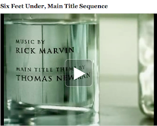
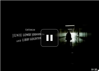
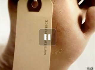
This is a Screen garb from the long road media website, of the clip which I am going to analyse.
